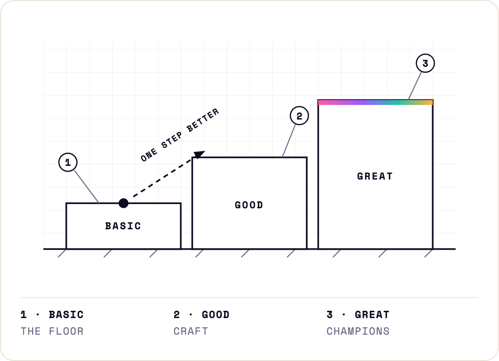
Not three drafts of the same thing. Three deliberate states. The basic version exists so the thing is real. The good version exists so the thing is right. The great version is the one I aim at knowing I will not always land it, and knowing that the aiming improves the other two.
I have applied this to design systems, to my CV, to my portfolio, to learning to draw, and to the newsletter you are reading now. The order is the whole method. Basic first, always, even when I can already see the great version in my head. Especially then. The great version in my head has never met a user, a deadline, or a rendering bug. The basic version has met all three by Friday.
Where it became a framework
Amazon, 2023. I was a design lead who had just started learning about accessibility. I honestly cannot tell you how I stumbled onto it, but it has served me well ever since, including in ways I did not expect, into motherhood, which is a thread for another issue.
What I found was an army of designers producing inaccessible work, and a VP-level goal handed to me: move accessibility from 80% to 95% across three organisations producing roughly 500,000 visuals a month. I had one exceptional woman beside me who could run the numbers and the spreadsheets, because this was 2023 and there was, as yet, no AI to do it for us.
The designers were not careless. They simply could not see it. A visual designer could pick the correct typeface and the correct background colour straight from the styleguide and still ship something that failed, and if the styleguide itself was wrong, then everything produced from it was wrong, at scale, every single month. Accessibility was invisible to the very people most responsible for it.
So, with allies around me, two exceptional women in two other organisations, I built a visual guide. And here I genuinely do not know whether to write I or we, which tells you something true about how this kind of work actually gets done. The guide ran every kind of work a designer touches, text, logos, product images, illustration, UX screens, against three levels: Basic, Good, Great.
Basic, the floor: the non-negotiable standard, WCAG for text, and a decided-upon internal minimum for everything the standard did not cover.
Good, craft: for the designers who already knew the standard and wanted to do a little more.
Great, for champions: the work almost nobody shipped, and for real reasons, the marketing copy that ran too long, the colour that did not exist in the styleguide, the minimum text size someone had set too small years ago and no one had touched since.
The guide was only half of it. The other half was persuasion. Monthly audits and audit banners run by people who volunteered their time, internal talks to socialise the guide, monthly reports for VPs, numbers crunched by hand, and slowly a team built around the processes so they would outlast any one of us. I am still grateful to those people. The framework was mine; the movement was ours.
We measured 80% at the start. Across a year, we reached 95%.
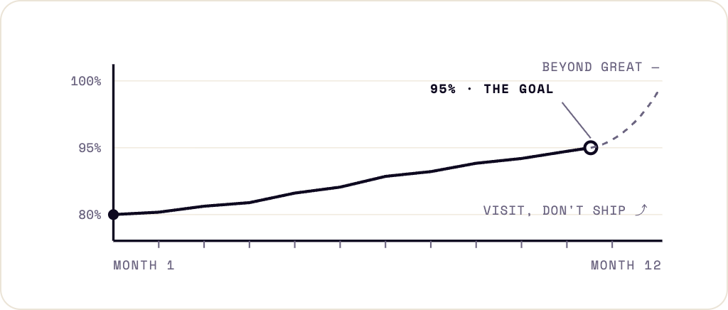
You may be wondering why not 100%. Because the last 5% is the hardest to chase, and a goal you can actually reach beats a goal that only sounds noble. Pure perfection does not exist; it is the thing beyond great, and beyond great is a place you visit, not a place you ship from.
And because I had a little time left and a little creativity, I went to visit it anyway. I started a side study to build accessibility checkers into automated marketing production. I had the idea, I made the proof, I built the Figma mock, and then I did not manage to implement it the way I wanted. It stalled somewhere between its second and third version. That is the honest ending, and I am keeping it in: sometimes the great version is a thing you prove is possible and then set down, because insisting on something that has already stopped moving is its own kind of failure. You learn to leave it and go build elsewhere.
But here is the part I only understood later, and it is the reason the guide worked at all. It never handed anyone a verdict. At any moment, every designer who used it knew exactly two things: where their work stood, and what one step better looked like.
A direction, not a verdict
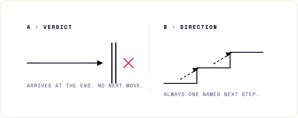
That is the entire difference. A pass/fail standard gives you two possible states: you passed, or you are demoralised. It arrives at the end, usually as a list of everything wrong, and it offers no next move. Basic, Good, Great gives you a place to stand and a direction to walk, and the only question it ever asks is: what would one step better look like?
People do not skip accessibility, or craft, or care, because they lack it. They skip it because "not good enough" is a door with no handle. Name the next step, and the guilt turns into work.
I have found the same shape everywhere since.
When I rebuilt my CV after nine years inside one company, the first version was basic, and it needed to be, because a basic CV that exists collects feedback and a great CV that lives in your head collects nothing. It got good when I asked friends for feedback. It got great when Jason Greene, a mentor from ADP List, talked me out of rewriting it for every single role, advice I should have taken sooner, and let one sharp version do the work instead. It gets invitations now.
My portfolio ran the same three states, in order. Version one was basic: I was only just learning to vibe-code, and it showed. It got good when I took it to former Amazon colleagues in my network and learned, from their feedback, to push my own taste and personality back into what the AI generated instead of shipping its defaults. It got great when I filled it with the real thing: project pieces, images, the evidence rather than the promise.
Basic first. Then good. Then, sometimes, great.
What this newsletter does with it
Every issue here is one true story from practice, one lesson, and one move you can run the same day. The stories will not be about perfect work. They will be about which level the work was really on, how I knew, and what moving up one level actually cost, in hours and in pride.
Accessibility runs through all of it, from your first line of alt text to expert-level auditing, because that is the discipline that taught me the method in the first place, and because it is where the distance between basic and great decides whether a real person can use the thing at all.
And I will say this plainly now, so you never have to catch me at it: most weeks, the great version does not ship. I would rather tell you that in the first post than let you find it out by counting.
This week's move
Not homework. A move, the kind you repeat at the gym: small, repeated, compounding. There will be one at the end of every issue.
Take one thing you shipped this week. Anything. Write three lines: what its basic version required, what would have made it good, what great would have looked like. Do not fix anything yet. If you cannot name the basic version, that is the finding, and it is worth more than the fix.
Basic is not a smaller word than great. It is only the earlier one. So the question is not whether your work is basic. It is whether you can stand in front of it and say so.
Alexandra
Need an accessible website, or an audit of the one you have? See the accessibility services I offer.